How far behind are open weights?
Twenty months of a public model leaderboard, rebuilt from web archives and rescored on a single ruler. At the top of the board open weights are six points behind, and that gap has no trend. At the price anyone actually pays, an open-weight model strictly dominates 313 of the 398 models on sale.
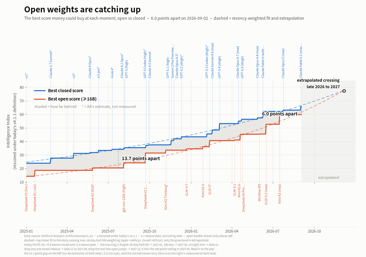
That last sentence is the whole trouble with reading this chart casually. The band is a sawtooth, not a trend. It widens the day a closed lab ships and narrows every day afterwards, and across twenty months it has been as narrow as 2.4 points and as wide as 16.7. Picking any two of those and announcing a direction is picking points.
Two things underneath it do move in one direction, and together they are the answer to how long the catching up takes.
The ratio of the two ceilings fell from 1.68× at the start of 2025 to 1.10× now, and it fell across the whole window rather than in one jump. A steady ratio is what a steady growth rate looks like, and the two sides do not have the same one: fitted in log space, the open ceiling compounds at roughly +144% a year against +81% for closed. The point gap can stay flat while that happens, because a shrinking multiple of a growing number is not a shrinking difference. Both things are true at once and only one of them is a trend.
The lag is the more direct answer, and it is deliberately not drawn on the chart. Take each closed release that set a new ceiling, and count the days before some open-weight model matched that score:
| Closed release that set the ceiling | Score | Days until open matched it |
|---|---|---|
| o1 · Jan 2025 | 23.86 | 216 |
| Claude 3.7 Sonnet · Feb 2025 | 27.62 | 210 |
| Grok 4 · Jul 2025 | 34.08 | 165 |
| GPT-5.2 (xhigh) · Dec 2025 | 43.34 | 130 |
| Claude Opus 4.7 (max) · Apr 2026 | 54.96 | 91 |
| GPT-5.5 (xhigh) · Apr 2026 | 56.31 | 84 |
| Claude Opus 4.8 (max) · May 2026 | 57.33 | 49 |
| Claude Fable 5, Opus 5, Fable 5.1 | 62.07–65.65 | not yet |
Abridged; the full series runs to 23 rows. The last three are censored, and that censoring is exactly what "open weights are 6 points behind" means: three closed ceilings are still standing.
216 days down to 49 over seventeen months, declining almost monotonically. That is the number I would quote if someone asked how far behind open weights are, because unlike the point gap it does not get reset by whoever happened to ship most recently.
How the gap is computed
One ruler, applied backwards
The published index cannot be compared across time, because it was redefined 16 times in 20 months: 11 changes that added or removed evaluations, and 5 silent re-weightings where the evaluation set did not move at all but the scores did. The worst lands on 9 January 2026, when 96.4% of the 365 models present on both sides of the change moved, a median drop of 14.92 points, with an identical evaluation fingerprint before and after. So the published score of the day is never used here. Every model is rescored under one definition, and that value is carried back to every day it was listed.
The horizontal axis is release date, not listing date
This one is load-bearing. The first version of this chart used the day the leaderboard listed a model, and in early 2025 that lagged release by a month or more, which manufactured a stretch where open weights appeared to be hugging the closed line. o1 shipped on 5 December 2024 and was not listed until 24 January 2025; for those seven weeks the closed ceiling was drawn at o1-preview's 17.2 instead of o1's 23.86.
Each line is a running maximum
Sort every model by release date and keep a running best on each side. A step appears when a release beats everything before it. Open weights are drawn only above 16B total parameters, and that gate can only apply to the open side, because closed vendors do not publish parameter counts at all. It costs nothing here: the open ceiling is identical on every day of the window with the gate on or off. Champions were never small models.
The crossing is an extrapolation, and it is fragile
The dashed lines are a log-linear fit to each daily running max, weighted back with a 60-day half-life; only the part on the grey ground is extrapolation. They meet in late 2026 or 2027, and that is as precise as this data supports. A 90-day half-life moves it to 2027-01 and 180 days to 2027-02. A straight line through the last six months instead gives 2026-11. Dropping any single recent release moves it somewhere in 2026-11 to 2027-04, and dropping the last two open jumps moves it to 2027-12. The fit also runs into the scale ceiling of 100 points in March 2027, past which it is not a model of anything. Read it to the year, not to the month.
The two labelled gaps are not equally trustworthy, which is why some names on the chart are starred. The 13.7-point gap on the left has the leaderboard's own estimated scores at both ends, and this dataset calibrates those estimates at ±6.5 to 8 points. The 6.0 on the right has measured values at both ends.
The kill line
Six points behind at the ceiling is one way to ask the question, and it is the flattering one for closed weights, because that ceiling is priced at $20 per million tokens. Ask instead what is worth buying at any budget, and the picture inverts.
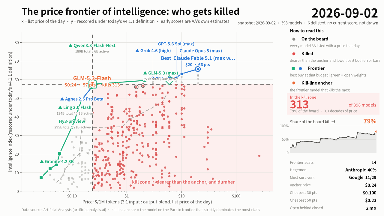
Plot the same models by price against the same rescored index. The Pareto frontier is whatever nothing cheaper beats, and 14 of 398 models cleared it. Then pick the single model on that frontier whose lower-right quadrant, dearer and worse, holds the most others. That is the anchor, and the L-shaped boundary through it is the kill line.
A domination claim carries a margin, because some scores are measured and some are the leaderboard's own estimates:
A kills B ⟺ price(B) > price(A) and (score(A) − δA) − score(B) > δBThe margin is charged to both sides on purpose; charging it only to the victim quietly asserts the attacker's estimate at face value. δ is 0 for a measured score and 4.5, 6.5 or 8.0 points for an estimated one, depending on how much of the suite has actually been run. Those three numbers are the 90th percentile of the observed error in 317 cases where an estimated score was later replaced by a measured one, a calibration sample the leaderboard produces for free.
Traced across the window, the share of the board inside the kill zone rises from 20% in January 2025 to 79% now. The anchor's price meanwhile barely moves: a median of $0.263 across 2025 and $0.171 across 2026. What changed is what the money buys, with the median anchor score going from 16.7 to 42.1. The market converged on a price point and then made that price point four times better.
The two doing the killing
For the last five months the anchor has been one of two models, and both are open-weight. The seven highest kill counts in the entire 20-month window belong to these two.
| DeepSeek V4 Flash (max) | GLM-5.3-Flash | |
|---|---|---|
| First listed | 25 April 2026 | 26 August 2026 |
| Blended price | $0.1675 / 1M | $0.2375 / 1M |
| Index score | 42.12 (measured) | 57.46 (measured) |
| Weights | open, 284B total / 13B active | open, 320B total / 18B active |
| Weeks as anchor | 18 consecutive | 2 and counting |
| Peak kills | 257 | 313 |
DeepSeek V4 Flash held the anchor for 18 consecutive weekly frames, from 26 April to 23 August 2026, the second-longest reign in the window behind Mistral Small 3.1's 20 frames in 2025. Its price fell slightly over that run, from $0.175 to $0.1675, and its score did not move at all, because on this axis a model's score is fixed by construction. What moved was everything around it: the board grew from 306 models to 383, and its kill count grew with it, peaking at 257.
The handover took two days. On 26 August GLM-5.3-Flash was released, listed, and took the anchor the same day with 310 kills. On 27 August DeepSeek V4 Flash left the frontier altogether, dominated by Agnes 2.5 Pro Beta at $0.15 and 49.10, cheaper and better at once, which is the only way off.
Cheap is not small
Both are enormous: 284 billion and 320 billion parameters, of which 13 billion and 18 billion are active on any given token. That is the mechanism, and it is worth being exact about, because "cheap model" and "small model" have come apart. A hosting provider prices the work it does per token, which is set by active parameters, not by what the checkpoint weighs on disk.
The counterexample is sharper than the examples. Qwen3.8 27B at maximum effort scores 52.02, measured, the eighth-highest open-weight score on the board. It has never once reached the frontier, across all 436 snapshot days in the panel. It is 27B dense, so 27B active, and its output is priced at $3.00 per million against $0.47 for its own vendor's Flash-Next, which has 180B total but only 6B active and scores higher, at 55.81. Blended, that is $1.125 against $0.23.
So a 27B dense model lands in the worst available position: small enough that you could serve it yourself, active enough that nobody will rent it to you cheaply. On an axis that measures rent rather than electricity, it never had a chance.
What this does not show
- The price axis is rent, not cost. It is what a hosting provider charges. Running open weights on your own hardware puts you somewhere this chart cannot draw, which matters most for exactly the models it is about.
- The gap has two ends of unequal quality. Early scores are the leaderboard's estimates, carrying a calibrated ±6.5 to 8 points. Anything read off the left half of the catch-up chart inherits that.
- Six models are missing from the last frame. They were listed with a price but have since been delisted and never rescored under the current definition, so they have no vertical coordinate. The effect is largest early: in 2024 it would have removed roughly a third of priced rows, which is one reason the window starts in 2025.
- 2024 cannot be joined to this. Of the 113 models listed during 2024, exactly one has a measured score under the current definition. The rest are interpolations, and the interpolation is not order-preserving: it puts Llama 2 7B above Llama 2 70B. Three separate bridging methods were tried and all three failed.
- The anchor is defined by count, not by merit. "Dominates the most rivals" pulls toward wherever the cloud of models is densest. It describes what the market is ignoring; it is not a recommendation.